Story behind the print: Little Wing
Hi!
It’s been almost a year since we released new prints and a new collection.
To be completely honest, last year at this time, I was sure, the collection is done. I didn’t have the energy to create new pieces as the first collection wasn’t as well received as I hoped it would be. But you blown me away with support for our second collection and I’m so glad we are here. Every time I get a message from you about how happy you are with the purchase it makes me SO happy and it’s all worth it in the end. I created four different prints for SS23 and today I’ll introduce to you the first print I’ve created. What I learned in the past few years is that you love reading stories about the prints I’ve created and finding about what inspired them.
This is why I’ve decided to share behind the scenes about each print from our collection.
Prints are usually either created in-house by the textile designer, outsourced through freelance designers or bought from print studios.
Fashion brand owners usually don't create their own prints, and this is what makes this brand special as I create both prints for my fashion label and design clothes.
Third print of the collection is called Little Wing,
after Jimi Hendrix song “Little Wing”
“Well she's walking, through the clouds
With a circus mind that's running round
Butterflies and zebras
And moonbeams
and-a, fairytales
That’s all she ever thinks about
Riding with the wind”
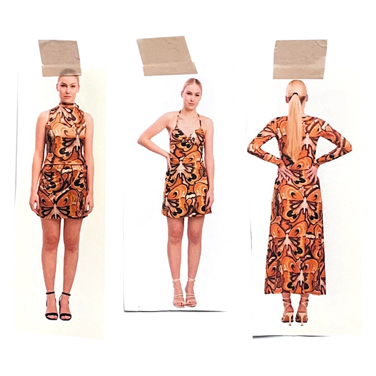
Little Wing is the print I’ve created while on vacation in Naples, Italy. To be particular, this print was created while we were waiting for the plane back home. We had around 12 hours to wait and I had nothing else to do and I knew I needed a last, fourth print for my collection. That was in the middle of September. We were sitting outside, and I had a sketch of butterfly already done, so I created an outline and added colours. The version I finished at the airport is the orange-blue-green version.
Because “Lola” and “Penny Lane” prints are super colourful, I wanted this print to be more calm, but to still resemble a spirit of the sixties and the seventies. The first colour version was orange-blue-green, but I later, after consultation with Niko, agreed, it needs to be more monochromatic and “earthy”. This print was actually the last one I created.
I think I made the right decision with going forward with the brown colour option, as it perfectly captures the spirit of the seventies. Below you can see some of the photos and what I was trying to capture with this print.
I wanted to invoke nostalgia and bring back memories, even if you didn’t grew up in the 70s and are only influenced by that decade. I was always fascinated with the seventies fashion and their use of colours. We could argue that 70s were the most stylish decade.
Regarding the inspiration for the design, butterflies were always these magical creatures for me. I remember being 5 or 6 years old, hanging out with my childhood friends in their backyard and we were looking at butterflies and being amazed at how beautiful they are.
Above you can see the outline for the illustration. To create a repeating pattern I added some extra elements (moons and some abstract elements) to fill the space.
Butterflies have a four-stage life cycle and moon also goes through phases (there are four main Moon phases).


